The global golf tourism market continues to expand at a strong pace. According to Grand View Research, market value reached approximately USD 27 billion in 2025 and is projected to keep growing at 9 to 11% annually in the years ahead. Mordor Intelligence further reports that direct website bookings are outpacing intermediary channels such as OTAs and travel agents. This shift confirms a clear trend: more and more golfers now prefer to research and book tee-times or golf getaways directly on a resort’s own website, rather than through a third party.
This shift has redefined the role of the website itself. In the past, a golf course or resort website served mainly as a visual showcase, a place to display course photography and service information. Today, it functions as one of the most important direct sales channels a property has. Every SEO effort, Google Ads campaign, social media push, and email newsletter ultimately drives toward the same destination: the website. But traffic only becomes valuable when visitors go on to take action, whether that’s booking a tee-time, reserving a room, or submitting an inquiry.
For golf courses and resorts, the real challenge is no longer just “how do we get more website visitors,” but “how do we turn more of those visitors into guests.” This is where the Call-to-Action (CTA) becomes the critical bridge between marketing spend and actual revenue. A well-placed CTA, with clear copy and a frictionless booking flow, can meaningfully lift conversion rates. Conversely, even a beautifully designed website can quietly bleed booking opportunities if its CTAs are weak or poorly positioned.
Connect to receive a free website audit from AGJ:
📞 +84 982 117 466
📧 creative@asiagolfjourney.com
1. Three Common CTA Optimization Mistakes on Golf & Resort Websites
Having reviewed numerous golf course and resort websites across Vietnam and Southeast Asia, AGJ has found that most properties don’t actually have a design problem. Many sites feature attractive layouts, high-quality photography, and solid content, yet still underperform when it comes to converting visitors into bookings. The root cause usually lies in how the CTA system is built and structured.
Below are three of the most common issues golf and resort properties tend to run into.
Mistake #1: No Clear Primary CTA per Page
One of the most frequent mistakes is trying to showcase too many services on a single page. Visitors land on the homepage and are immediately met with Book a Tee-Time, Book a Room, Membership, Dining, Weddings, Spa, and Contact Us, all competing for attention in the same first screen. When every option is emphasized equally, visitors take longer to decide, or simply take no action at all.
For any landing page or service page, there should be one clear conversion goal. If the page’s purpose is to sell a Stay & Play package, the most prominent CTA should be “Book Your Stay & Play Package.” Every other action on the page should play a supporting role, not compete for the spotlight.
Mistake #2: The CTA Appears Too Late
Many websites only introduce their “Book Now” button after visitors have scrolled through multiple sections of imagery, course descriptions, amenities, and pricing tables. In reality, most visitors decide whether to stay on a website within the first few seconds.
That’s why the most important CTA should appear above the fold, visible the moment the page loads, without requiring any scrolling. If a guest already has the intent to book, they shouldn’t have to hunt for the button that lets them do it.
Mistake #3: The Mobile Experience Isn’t Optimized
The majority of golfers and travelers now research golf courses and resorts on their phones. Yet many websites still carry over a desktop-first design: CTA buttons that are too small, tap targets spaced too close together, or a booking button that disappears entirely once the user starts scrolling.
An effective CTA Optimization needs to remain visible, easy to tap, and reliably functional across every device. Many leading brands now use a sticky, fixed booking button at the bottom of the mobile screen, so guests can book at any point in their journey without needing to scroll.
2. What Are Leading Resorts Doing Differently?
Rather than cramming as much information as possible onto a single screen, top-performing golf and resort brands share one thing in common: they know exactly what the single most important action is on every page, and every layout, image, and piece of content is designed to guide visitors toward that action naturally.
Case Study: Aman Resorts, Simplicity Drives Decisions
The Aman Resorts website is a strong example of minimal but highly effective CTA design. Right within the hero section, visitors immediately see a clear “Reserve” CTA, while other content such as destinations, experiences, and amenities plays a supporting role.
What’s notable is that Aman deliberately avoids overwhelming visitors with choice. The interface relies on generous white space, large-format imagery, and very few competing CTAs, so users always know exactly what the primary action is. This approach is particularly well-suited to luxury brands, where a refined guest experience matters just as much as conversion performance.
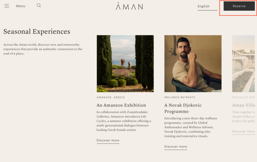
The Reserve CTA button is always visible and prominent when users browse the Aman website
AGJ’s perspective: For luxury resorts, a CTA doesn’t need bold, saturated colors to be effective. What matters is sufficient visual contrast for the button to be easily noticed, while still preserving the brand’s sense of refinement and elegance.
Case Study Pebble Beach Resorts: Designing a Conversion Flow Instead of a Single CTA
One of the most valuable lessons from Pebble Beach Resorts is its focus on designing a complete conversion flow rather than simply optimizing a single call to action. At first glance, the Hero section appears to challenge the common CRO principle of having one primary conversion goal, as it features three prominent CTAs: Plan My Trip, Explore Offers, and Book a Meeting. In reality, these buttons are not competing conversion goals. They serve as entry points for different types of visitors.
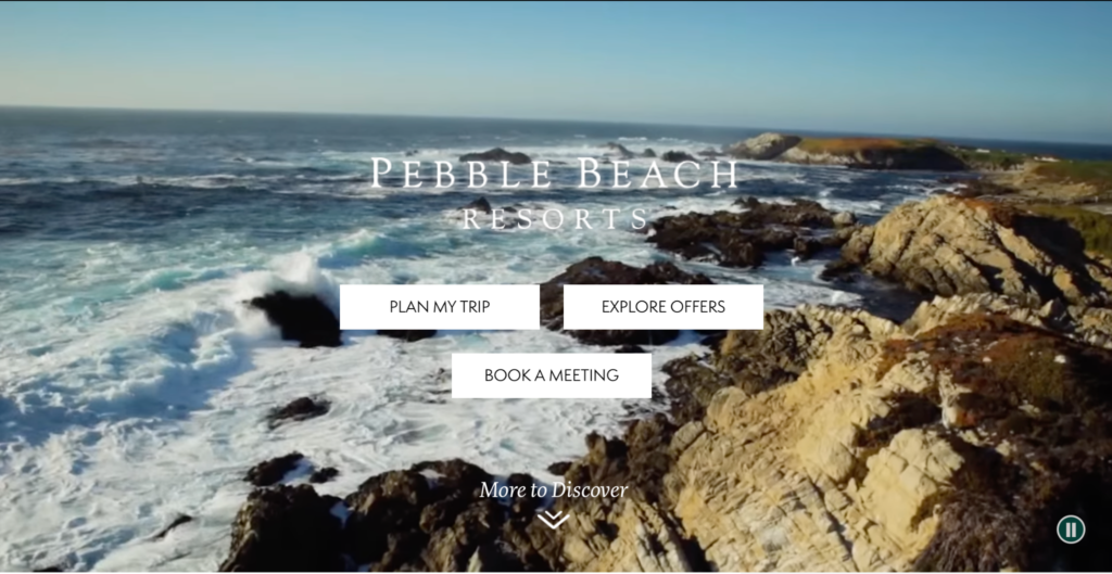
CTA buttons on the Hero Section of the Pebble Beach Resorts website.
Guests who are ready to plan a golf vacation naturally begin with Plan My Trip. Visitors who are still comparing options can choose Explore Offers, while corporate clients and event planners are directed to Book a Meeting. Instead of asking every visitor to take the same action, Pebble Beach recognizes that users arrive at different stages of the decision making process and provides a journey that matches each visitor’s intent.
The key difference is what happens after visitors choose their path. Once they enter a specific journey, each landing page focuses on a single, clear conversion goal. The Hero section simply directs visitors to the most relevant experience, while every subsequent page is optimized for one primary action. This is the difference between multiple CTAs and multiple competing conversion goals.
Pebble Beach also demonstrates how conversion optimization extends beyond button design. According to the resort’s official booking policy, guests are encouraged to request their golf tee time while booking their hotel stay, rather than making separate reservations for accommodation and golf. This reflects how most golf travelers actually plan their trips. They are not looking to book a room or a tee time independently. They want to organize a complete golf vacation through one seamless process.
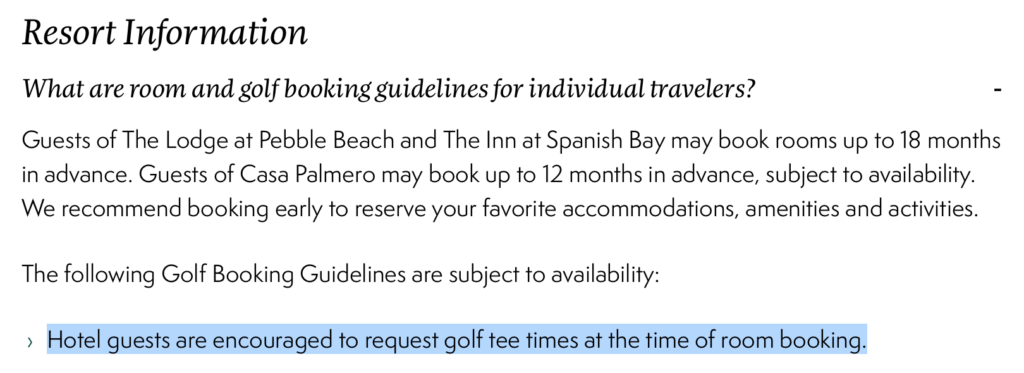
Pebble Beach Resorts encourages guests to request tee-time during the hotel booking process
Reference from website of Pebble Beach Resort
Optimize your golf or hotel website with AGJ’s professional website design package:
📞 +84 982 117 466
📧 creative@asiagolfjourney.com
3. A 2026 CTA Optimization Checklist
After analyzing leading websites in the space, here’s how any golf course or resort can start evaluating its own site.
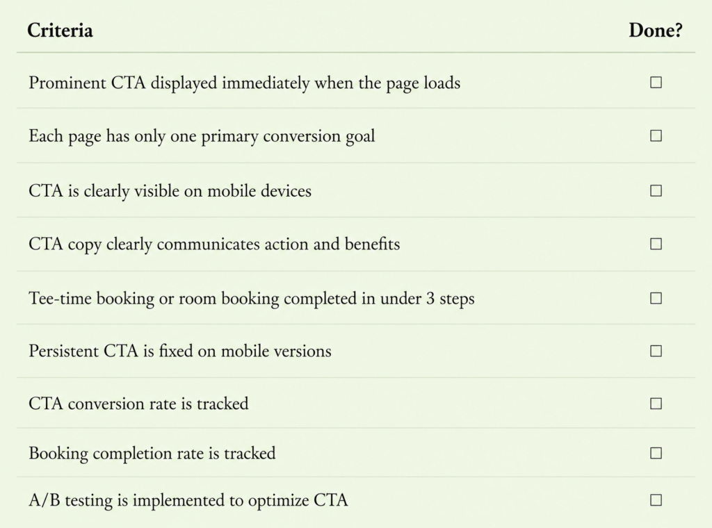
Checklist for optimizing CTAs on golf course and hotel websites
Asia Golf Journey: Your Partner in CTA Optimization and Revenue Growth
As marketing costs continue to rise and booking behavior shifts decisively toward online channels, a website is no longer just a digital brochure. It’s the critical touchpoint that determines whether a visitor becomes a paying guest.
If you’d like to find out whether your website is quietly losing booking opportunities, AGJ’s team offers a free website audit. We go beyond interface review, assessing the entire guest journey from first visit to completed booking, to pinpoint exactly where improvements are needed and recommend solutions aligned with your business goals.
Get in touch with AGJ’s team:
📧 Email: creative@asiagolfjourney.com
📞 Hotline: +84 982 117 466
The Leading Strategic Partner for Golf, Sports & Hospitality in Vietnam